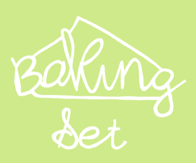
On the previous post I created a type and one of the words 'set' I mentioned was a really good reverse out. This gave me the idea to laser cut the title into the packaging. I have developed an initial idea with the shape of a cupcake and the product title. This was the most successful title development. I have focused the designs on hand drawn type and look, the first is quite chunky which stays away from the 'delicate' look which may take away the simplistic classy look I am hoping to achieve. However it is legible and fun looking which is something I need to put across in the overall product.

This second type doesn't work as well I don't like the flick on the cupcake, the style of type works but I don't think its as successful over all as the first. A second thing I am taking from this is although I wasn't intentionally looking at colour, I have found this shade and other pastel lighter colours don't work as well as darker does, especially if I am just laser cutting shapes out.
There is something I quite like about this, its very child like with the stencil styled type although this wasn't intentional I only did this so the whole letter wouldn't drop through once it has been cut. It has a different quality to it and appears to the younger audience of children 3-6 rather than 6 -12. The bright colour also works really well in contrast with the white, much better than the example above.
This is my favourite of the four, however I cant decide weather it is too grown up for the product in comparison to the options above, I will only really be able to tell this once I start pocking up the designs and get some peer feedback.


No comments:
Post a Comment