
I have decided to digitalise all of the flowers first before putting together any wallpapers, when I started doing this, I had to constantly remind my self to keep in the style of Laura Ashley, they use very pale feminine colour schemes, even the boys or more unisex wallpaper has pale pastel colours. I actually really enjoyed this as I particularly like working with this colour scheme much more than bright colours, so i found it easy to match up different colours and shades. I really like this first example, it has a really delicate quality to it and i think this is mainly due to the line but supported by the choice of colour.
The second is similar to the layering affect I attempted earlier, this doesn't work as well on its own as the above, however I feel with more layering or a mixture of different styles this could work really well on a larger scale. I also particularly like the us of pastel colour, I really like the cool blues working with very pale almost white blues. This is also quiet a unisex colour, which can be classed as a feminine and masculine colour which i would rather use.

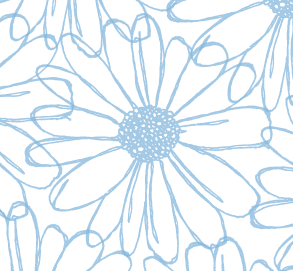
I really like this, I think the detail of it makes it look really beautiful and it is perhaps the closest illustration to Laura Ashley, the only concern I have with it is, I think it is suited towards fabric rather than walls. Putting this aside the combination of two different colours works really well, and this introduces more than just one colour to the pattern.

After looking at the different types of flowers Laura Ashley use, I decided I should try and add a little more to the singular flowers, im really not sure I like this it is only a small sample of what the illustration would look like, but I feel adding the outer circles take away from the beauty of the centre flower and make it look more suited towards a small girls bedroom.

Again the same applies to this final flower, I though I would post it just to show the difference in the earlier few that are the same to show how the difference in colour can completely change the image and in my opinion make it much less appealing and the beauty of the detail in the line is taken away.

No comments:
Post a Comment