After spending so long trying to laser print my designs and failing, I have decided I need to make a new start and finalise the pattern work I intend to use for the inner products of my packaging. I hope this will help me move forward and establish the outside design of the packaging.
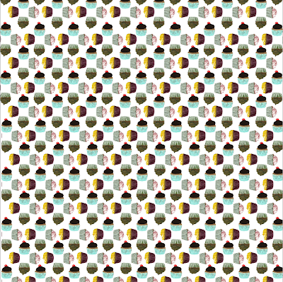
The first pattern uses the collaged buns, the out circle of buns in a new concept I recently experimented with and I think it works really well. However aside from the layout of the pattern the coloring of the buns is extremely dull and gloomy. Individually and close up these colours are really vibrant but put together in this way the colours don't work at all.

I really like this pattern, the colours are really vibrant and 'yummy' I need my products and packaging to look really appealing and interesting and these shapes and colours definitely help. I have again used collage buns for the repeat pattern, but these seem to have a much better over all affect that the above pattern, I think the contrast in colours for the outer ring of buns to the one in the centre really help.
This pattern again is much more appealing than the first however, not as tasty and appealing as the second. This I feel is a more unisex pattern, I had intended to make a product which is suitable for both boys and girls, but the more I have spoke to people in crits and discussions people have suggested I look at the products separately and make one for a girl and propose a second for a boy, especially as cooking tends to be seen as a more girly activity.
This pattern I have developed further from the second pattern above, but I have change the outer circles to try and make it more unisex, I still really like this pattern but, it just doesn't seem to be any where near as appealing as the original. A second thing new element I have added to the pattern is the rows of buns are upside down,I really like this and such a small change has really made a big different to the overall affect of the pattern.
The next pattern is very typical or my original designs, the blocking and layering of buns, I have used the 4 best collaged buns and individually they work really well and are bring and colorful, but working together it looks really gloomy and dull. Something I definitely do not want for my products, it is also far too full and clustered to work appropriately for my designs, there is too much going on for it to be of interest.
I really like this last design, I have had a lot of comments on the individual illustrations, it looks really delicate and girly. The only problem I have with this pattern is that it doesn't really fit in with any of my design intentions. Most of my upto date work and mock ups follow the theme of the collaged buns.


No comments:
Post a Comment