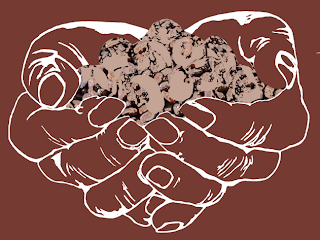
I mentioned earlier I would add some colour to illustrations to see how they work, the first hands I have filled with cocoa beans to see how this works, this adds texture and depth into illustration, there are parts of this I like, I dont think the illustration beans are working with this background, It all seems to merge into one.

I dont like this one at all, I think perhaps it is the white that isn't working its too harsh against the brown colour. However this has given me the idea to use a brown foil to replace the white of the hands this would add a touch of luxury to the image, im not sure on the beans I still think further development is need on this area.
As I felt the white was too harsh I decided to try it out with a brown colour, this two tone affect is used on the website, It really doesn't work but I do think the brown on the illustrated beans does work better than the white. As the focus of this product is the ingredients, I think this illustration would work best if the emphasis was on the beans and taken away from the hands, perhaps just the foil working on the beans would work better.
The next two illustrations are very similar, I have just altered the colour on top of the beans, this is a similar affect to how the foil would work on the beans. I think the top slightly lighter shade is working better, although there is not much difference, the colour seems to blend better withe the background photograph than the last one.


No comments:
Post a Comment