
Although i changed subject to science, i had made lots of illustrations already so i have decided to test them out one last time to make sure i definitely dont want to carry on with this subject.

Alone the flags worked really well, even with the image of the planet within them, however as a whole with the type and the orange blocking its far too much and doesn't work at all, it looks really confusing and busy. The Bitesize logo and type at the top of the page i have decide is also far too big it takes over, i needs to be much more minimal than it is.
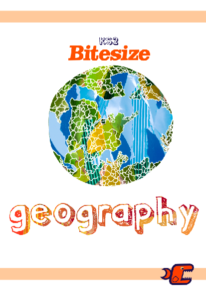
The above cover is so simple and clear it works really well, quiet a lot of people have commented on how successful it is, however i do feel it has too much white space and not enough individuality and i know this layout would no work for all the covers as they will look like they have floating illustrations in the middle of the page.

I really like this cover, its so interesting and as a whole works well (in my opinion) the plan for the word 'geography' was for it to be laser cut out. This definitely grabs your attention compared to the other covers and even looks fun to open and discover whats inside. However on the downside this will not work for any of the other subjects and i want them to run as a set.

I really like these illustrations working together, but i dont feel they work well with the book cover, i think this will be much more successful for the posters.
No comments:
Post a Comment