Wednesday, 13 October 2010

Birds & Flowers


Its not very clear to see on the first design but the background is covered in a pale blue flower layered on top with a darker colour of the same flower and the bird, this works really well the layout is simple but affective, if anymore of the birds or darker colour flowers were used I think it would be too cluttered and it wouldn't work across a large wall. The second design also works well mixing the two flowers an birds but it doesn't have the same impact as the first. The colour is too dark to cover a large space, but i think anything too light would show the large empty spaces in the background.


The first is really pretty and layout work really well, the combination of the flower and the bird cluster together with just the right amount of spacing. If I were to choose this design I would want to re layout the flowers so they look more naturally spread, this is the only thing I think needs developing. The second uses a similar flower design but they are smaller, this is much more detailed an perhaps on a large scale this would just be too much. The birds dont work as well with this layout the bird is too detailed to be so close to the flowers they are almost lost into the background.

Birds - 1 colour

Whilst I was sat putting together all the different designs I had the idea to develop the flow and but it hasn't turned out in as in my head, It does work but the design is too contemporary for the Laura Ashley range. I think this style would work really well for the patterns for the cooking brief.

Tuesday, 12 October 2010

Initial flower wallpaper


After making all the individual areas I thought it would be best to start putting everything together, there are many different things I will need to consider when I finally pick my wallpaper design. The first is a typical design i have added a texture to the background to try and make it at a bit different but it doesn't really stand out as anything special. The second i really like, I want the final design to take a very minimal approach and this is perfect, it could be considered as too plain, but close up the flowers are really detailed and this could be perfect to develop with birds.


The first shows the flower I mentioned i really liked earlier, it is layered with a circular pale colour smaller than the flower underneath, I love the flower close up by itself but hear it looks too much like a snow flake. You cant really tell what its going to look like on a computer it really needs to be printed to see the real size especially with the flowers being so detailed. This next wallpaper, is my favourite so far I really like the overlap of the lined flowers combined with the solid circles it works really well and this is most in keeping with Laura Ashley style. I also feel the simple one colour works really well with this design and doesn't need anything extra added to it. In terms of printing this is a plus as its would be cheaper to professionally print.


I love the 2 colours used in this pattern, the work together really well and introduce two colours to the room, however again the pattern is hard to tell if it would work or not with the detail. A development of this design I feel is necessary would be the colour for the background, even if it was a very pale blue it needs something to take away from the harsh white. The final design combines a second design with the flower, I felt these flower might need something to break up the detail, but again I cant really comment as I need need to print out all of these design full size, this is a must in my action plan I really cant move forward with any final developed designs until I do this.

Birds Digitalized

A large amount of Laura Ashley wallpaper have birds on them, I dont particularly like the way most of them are illustrated this is definitely an area I decoded I wanted to concentrate on when I chose Laura Ashley and tropical. They are each illustrated very similar to how I have developed the flowers, with nib and ink then transfered onto the mac and added colour.


This first bird is the humming bird, I drew different images and narrowed it down to this one, its different to the others in that there are two birds perched on a brach. This gives me lots of opportunity to work with different flowers but more specifically the brach flower which I feel is going to be most ideal for this brief. The colours are in keeping with the Humming Bird however im not happy with the different shades I have chosen for the above illustration, it makes it look quite 'cartoony.' The choice of colour will follow through with the colours used for the flowers.

Second is the Honey Kreeper, this is my least favourite illustration, I dont like the way I have captured the wings, this bird is however in an ideal position for mixing it with flowers in an almost real life position. I just really dont like the original illustration its not as strong as the others so if i do chose to use the Honey Kreeper I will have to re illustrate.


I love the coloring for the kingfisher, they are such a vibrant beautiful array of colours and this introduces more to the choice to to the overall wallpaper colour. I love the illustration for this bird, its as simplistic as the others but it seems to work much better, I feel this is due to two things, firstly the colour and secondly the wings are not as viable as the other three, which is the main weakness on the other images. As much as I prefer this bird I do feel it will be the most difficult to mix with the flowers and it wouldn't work on its own.


Finally the Bee Eater, this is in a similar position to the Honey Kreeper, I dont like the coloring on this bird but that can easily be changed to make more neutral colours similar to the Kingfisher to make it more successful. The positioning and detail on this bird is much stronger than the above honey Kreeper, it will work really well with all the different shapes and sizes of flowers without dominating the wall. I think this area of the birds i really need feedback on I have found it hard to judge what does and doesn't seem to be work, outsiders views will really help in the crits.

Sunday, 10 October 2010

Flowers Digitalized

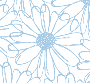
I have decided to digitalise all of the flowers first before putting together any wallpapers, when I started doing this, I had to constantly remind my self to keep in the style of Laura Ashley, they use very pale feminine colour schemes, even the boys or more unisex wallpaper has pale pastel colours. I actually really enjoyed this as I particularly like working with this colour scheme much more than bright colours, so i found it easy to match up different colours and shades. I really like this first example, it has a really delicate quality to it and i think this is mainly due to the line but supported by the choice of colour.


The second is similar to the layering affect I attempted earlier, this doesn't work as well on its own as the above, however I feel with more layering or a mixture of different styles this could work really well on a larger scale. I also particularly like the us of pastel colour, I really like the cool blues working with very pale almost white blues. This is also quiet a unisex colour, which can be classed as a feminine and masculine colour which i would rather use.


I really like this, I think the detail of it makes it look really beautiful and it is perhaps the closest illustration to Laura Ashley, the only concern I have with it is, I think it is suited towards fabric rather than walls. Putting this aside the combination of two different colours works really well, and this introduces more than just one colour to the pattern.


After looking at the different types of flowers Laura Ashley use, I decided I should try and add a little more to the singular flowers, im really not sure I like this it is only a small sample of what the illustration would look like, but I feel adding the outer circles take away from the beauty of the centre flower and make it look more suited towards a small girls bedroom.


Again the same applies to this final flower, I though I would post it just to show the difference in the earlier few that are the same to show how the difference in colour can completely change the image and in my opinion make it much less appealing and the beauty of the detail in the line is taken away.

Flowers Digitalized

I mentioned on an earlier post the layering of stock and hand drawn images wasn't working as successfully as it could. I have opted to digitalise these in a similar way to how I digitally collage my work however instead of collage I am using flat colour. This is very typical of wallpaper illustrations, and in keeping with Laura Ashley style.
I began my illustrations using pen and went on the experiment with nib and ink, I decided to use this similar experimentation with layering, the first circle is very neat and round and the second is much more varied in shape and loose. The first is too strict and harsh, especially for the free flowing flower encased within it, the second circle looks much more welcoming and fits with the flowers style. This decision lead me on to hand drawing circles and scanning them in to use, it works much more successfully and fits the style I want my wallpaper to have.

Mock Up rooms