Saturday, 30 October 2010

Bed Designs

As part of my brief I am designing a bed cover to fit in with the range of bedroom products. I though it would be helpful before deciding on my final wallpaper to look at how the patterns would fit working in a different media. The first pattern, over all works really well and fits in with the Laura Ashley theme, the colour is very calm and still feminine although it is blue. If I do choose this pattern I still intend to use silver in the circles on the pattern this will add something unique and special to the pattern (you cant see it on the mock ups).

This first bedcover works really well I have altered the pattern slightly so it is a little different to the wallpaper patter, this will make it more interesting but it still all ties together. The pattern faded out at the top of the cover is a traditional bedcover design and works really well with the pillows which are covered in the same flowers.


I dont like this second cover as much as the first, I also feel it doesn't fit the Laura Ashley theme as well as it could, it looks more like a cheap bedcover than something from a luxury range.


The third bed cover, I really like the pattern fading up into the cover it works really well fitting in with the feminine and elegant feel you get from the pattern. However I dont feel the pillows are working at all, they take away the expensive feel of the cover and make it look cheap.


This pattern almost reminds me of Ikea and is definitely not the look I am hoping to achieve, even with the gold added to it, I feel it still wont fit in with the laura Ashley style. The plain pillows however work well with the very cluttered bedcover. After looking at the above pattern, the colour of the below seems too bright and wild to fit in with the style I am hoping to achieve, although this could fits in more with the tropical theme.


For some reason this bedcover pattern reminds me of china, im not exactly sure why but this makes me like it even less. The style of the pattern works well but it doesn't flow as well as it could. It doesn't jump out to me or make me feel it is anything special or expensive or even from Laura Ashley.


I quite like this design, however I do feel it would work much better if the colours on the main sheet were opposite, this would add a more expensive and delicate feel to the bedcover than it already has. If I am to use this pattern I need to find a way of making it look more delicate so it fits in better with the Laura Ashley theme.


Friday, 29 October 2010

Final Swatches

As i mentioned on the previous post I wanted to further develop my new patterns and add something to them to define them as speciality wallpaper. I have used the same approach for all of the wallpaper samples. The first was my original pattern developed, I have change the birds so they are silver, this works really well and definitely adds the unique quality I wanted to achieve. From the change of the few areas I decided wasn't working I much prefer this developed design and I can imagine it spread across the range of products in my brief.


This second design I have added gold, it is slightly warmer than the other two designs and reflects the theme of tropical slightly more. However with this addition of the gold circles I think it has moved away from the very typical Laura Ashley look a bit too much. But this aside I do really like the overall affect of the the wallpaper design.


The final pattern was one of my original favourite and I thought the added affect of the metallic ink would really set it off and improve it and it does look good, but just not as successful as I thought it would be. I actually prefer it without the silver and the whole pattern just using one colour worked much better as a wall piece.

Thursday, 28 October 2010

New Patterns

I have got straight on to designing some new wallpaper patterns to move forward with. All 3 are developed patterns from my previous swatches, I have taken aspects from the ones I personally like and ones that fit well with the Laura Ashley brand, I have tried to mix both of these and come up with 3 new patterns. All 3 of these patterns are shown in their basic form and all could be printed as this version as a 'basic' range, however I intend to add something a little extra to these to make them speciality.


This first patten was one of my favourite from my original designs, I wasn't convinced however that it would fit in with the Laura Ashley Brand, so I went back to the shop and looked at their range within this colour scheme and pattern. I found this design does fit, however it is not an obvious Laura Ashley design, which is what I have found when getting feedback from other people on which pattern to choose. This could be problematic but as I am designing speciality wallpaper I think I could work around this.


I really like this pattern and its different from the rest with the choice of colour, this flower pattern is probably the most similar to the Laura Ashley range, this is positive in the fact it fits in as an obvious choice, but I never wanted to design something obvious, which puts me of developing this further. Finally I have really struggled with laying this pattern out side to side and top to bottom, I have only managed to achieve the top to bottom, as matching side to side includes corners which is where it becomes complicated. With this in mind I dont really have to time to spend working out the layout which would be needed for a repeat pattern of this.


This final pattern is a development of my first attempt at screen printing. I decided to do this as I originally got the best feedback for that pattern and the individual aspects of it, I felt I just needed to develop on the points I rose on my previous post. I have firstly changed the colour, making them deeper in tone and less harsh making the illustrations clearer and more fitting with the Laura Ashley colours. Secondly I have changed the layout and size of the birds and central flower. To achieve a fuller affect I have added two bird to each flower and enlarged the central flower, this really helps with the overall composition of the pattern. I much prefer the final pattern design now I have developed the weaker areas.

Wednesday, 27 October 2010

Wallpaper Screen printed

I have finally got round to choosing my wallpaper design and screen printing it so I can move on with the rest of the products I intend on making for this brief. After spending all day and more making the screens and printing, it is a fail. First of all the screen beds had been recently greeced and not wiped down so a large area on my paper got greece on it, meaning I couldn't use it for my final hand it, which was very frustrating. However looking back at it and evaluating it I decided infact I didn't like this pattern in full size, it just doesn't work as i had hoped. There are potential simple improvements I could make to it such as, adding more flowers and birds as there aren't really enough and as well as this changing the colour scheme because I really dont like these working together. Or my second option is to go back and redesign.


Redesigning does raise several questions to me and gives me the opportunity to improve on the areas I feel haven't worked on my first attempt. How can I make the wallpaper look more desirable? How can I use the current designs but in a more interesting and successful way? What colour scheme looks expensive and homely? These are the 3 most important questions I need to ask myself whilst redesigning the final wallpaper, these I feel are the 3 weak areas of my first attempt.


The colour scheme is really important to me, especially as I want it to feel like a Laura Ashley product, they have a very limited and fresh colour pallet, this doesn't fit in with their collection. Although it is a specialty wallpaper which gives me more freedom, this still moves too far away from what i am aiming for. I think for me to achieve this I will need to go collect some more samples and use a current colour pallet they have, and add something to my design or ink to make it more desirable.

Laser Cut Layouts

I have decided I really need to start making some decisions and stop working around ideas. So I have made some layouts for the laser cutter, they all vary slightly in the pattern layout and box shape, so I can see what works best. The first box has patterns on the top fold section and the two sides. I quite like this box shape and I haven't experiments much with it, so it will be really good to see what this works out like.


Working with the same box shape, I have used a different type so I can see which works best with the backing and the inner letter shapes stuck on. There is also much less pattern work here and the buns are enlarged, I have done this to see how a more minimal approach to the packaging works if the fuller patterns make the other boxes less stable.


This final packaging design is very heavy with pattern, this is similar to the original design I had in my head when I though of using the laser cutter. With this being so pattern heavy I will also be able to see how sturdy the packaging will be once folded.

Tuesday, 26 October 2010

Possible Final Pattern

After speaking to several people and a few tutor feedback comments, I decided this was the most Laura Ashley like wallpaper and fitted in with the theme I wanted to carry on with. I used different aspects from the swatches and developed this pattern. It has taken me a long long time to set out the flower pattern, the background flowers need to match top to bottom, side to side, corner to corner... HELL. I have finally achieve it and it works. To achieve the expensive and more desirable affect I want for my specialty wallpaper, I have been and spoken to some technicians in the print room and they have suggested the best method for me would be to digitally print the background flowers and screen print my bird and large flower.

Moc Up Digital


Moc Ups for Laser Cutter

I was sat playing with different patterns and shapes and I have had the idea to laser cut tiny buns and the logo into the packaging and this would be the basis for the whole design, nothing too fussy and over the top, but still sticking with the crafted and simplistic look. I think this will give a really nice but expensive feel to the product and will help it stand out against the other products on the shelf.

I have played around with the different shapes I photographed and different types of pattern I have currently experimented with to see what works best. The first works well, its really plain and only has use of a few bun tops and the logo. It is slightly too simplistic and more could be added, but at the same time it has a large window for you to see into the product, with this and a large space of pattern it may be too much, something I will have to develop. The second box, I really like the type sitting on the window, but I feel there is slightly too much going on in the background, there is also a potential issue of there being too much cut out for the product to stay together solidly.


The third box is hard to see the design, but it is basically the same pattern as the other boxes however here instead of the shape dropping through of buns, its the outline so a line of the shape would be shown instead of a hole. This may solve the possible problem of the box not being solid, but at the same time i'm not sure it would have the same desirable and expensive look as the drop through. The second box shape works really nice its more square and flat in shape than the other similar box, I really like the way the pattern is focused on the top part of the box, leaving emphasis on the 'baking set' and they work really well together, the pattern laid out like this may also help with the solidity of the box, with the four walls needing to be the most sturdy.


I dont like this type face, working with the patterns it doesn't fit with the patterns as well as the others, the bun illustration is working really well and I think I will expand on this making a repeat pattern from it, I think it has a slightly more interesting quality to it the that other patterns I have being using. This final box, i'm not sure of the long and thin shape, it doesn't seem to suit as well as some of the others, this can only really be determined by the mock up of it. The colour doesn't really help this box design its too pale and candy floss like, I have realised from this its really important I get the colour scheme correct.


Monday, 25 October 2010

Packaging shape ideas

Im not exactly sure what I want for my packaging or in fact what is achievable, I don't want anything too fussy or over the top. From the beginning of this brief i have had simplistic in my head, non of my design ideas up to this point are over the top or cartoony and i want to keep the packaging in a similar style to my illustrations - crafted and child 'like'. I think depending on the shape of box i choose depends on what the outside illustrations will be, this in mind I have started folding some boxes to see what shapes work best. This first box is very plain and simple almost shoe box like in shape, its far too straight forward and boring and I cant imaging i would capture you attention on the shelf. A second weakness which is relevant with such a plain box is there is no window on the packaging for you to see into what the product looks like/is.


This second shape is very similar to milk cartons which links to children drinking it at school, it is also a very adaptable and interesting shape. I really like the added curve to make the bottom half more of a box shape, compared to the regular similar shape. This shape would also be very useful for fitting in all the different products within it neatly. A window could be added if necessary dependant on the over all affect of the shape and illustrations put together.


This first box shape is similar to the first picture, however it ovens at the top in one piece rather that in the centre with two pieces. It works well and there is a large space for the product to be seen,which I think may be essential at this point as most similar products I have research feature a window of some sort so you can see what you are buying into. The second box again is very similar however its much more narrow in shape and I think the curved corners in the window are much more welcoming and friendly in contrast to the one next to it. The addition of the tab of the box adds a much more professional look.


The first box is very similar to the second photograph, however this is much narrower and taller that the first, a more traditional packaging shape. I really like these two looks and I think i'm going to concentrate on this type of shape, it suits my designs and theme really well. This second box is interesting because its a different type of shape to the others, it looks professional and has a window, i'm just not sure how my work will fit with it, I can only figure this out by applying my designs to all of these shapes which is my next step.

Logo Development

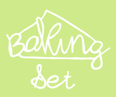
On the previous post I created a type and one of the words 'set' I mentioned was a really good reverse out. This gave me the idea to laser cut the title into the packaging. I have developed an initial idea with the shape of a cupcake and the product title. This was the most successful title development. I have focused the designs on hand drawn type and look, the first is quite chunky which stays away from the 'delicate' look which may take away the simplistic classy look I am hoping to achieve. However it is legible and fun looking which is something I need to put across in the overall product.


This second type doesn't work as well I don't like the flick on the cupcake, the style of type works but I don't think its as successful over all as the first. A second thing I am taking from this is although I wasn't intentionally looking at colour, I have found this shade and other pastel lighter colours don't work as well as darker does, especially if I am just laser cutting shapes out.


There is something I quite like about this, its very child like with the stencil styled type although this wasn't intentional I only did this so the whole letter wouldn't drop through once it has been cut. It has a different quality to it and appears to the younger audience of children 3-6 rather than 6 -12. The bright colour also works really well in contrast with the white, much better than the example above.


This is my favourite of the four, however I cant decide weather it is too grown up for the product in comparison to the options above, I will only really be able to tell this once I start pocking up the designs and get some peer feedback.

Type Developed

After developing the recipe type, I realised it would be much more positive start to look at the outside type and information, before I look at the inside. I have again hand drawn the type, but this time I have been able to look around different style as it is for a header. The first is really simplistic and could work across a range of designs. There is noting particularly memorable about it, but on the positive its legible and in keeping with the theme.


The second is very similar to the hand drawn recipes I posted earlier, I feel for a header and representing the product on a shelf, it doest jump out at you, this is partially due to the thinness of the type and possibly the colour. However I really like the linking of the letters they flow really nice from one to the other.


This is one of my favourite, its really playful and different from the rest the only small problem I have with it is im not sure how well it will work the illustrations or on a larger scale.

This is another favourite, most of my initial quite designs had this style of type on them, and when I was younger I used to do this all the time to my titles, this is where I originally got the idea from, to try and tie in with the audience. It also fills a bit of extra space and makes the lettering stand out and present it as a title which is what I feel the others were missing.
Im not sure I like this, but there are small things I like; the two different types and sizes works really well and add something a little different to the titleing, especially as I want my design to be quite minimal with nothing too fussy, this would really help add a focus to the product.


I like the style of this type face, but not for use as a main brand title it doesn't bounce out to me which is what this product ideally needs, especially when next to other competitive brands. However that aside I do feel this type of type would be suitable for the recipe lists as its not to fussy but still interesting to look at, if I am to look at this style the colour will not be taken forward, it looks really cheap and amateur.

This type is in a similar style to the one above, however the line is not as neat and because of this I don't think its works as well. The word 'set' works really nice with the reverse of colours this is similar to the laser cut types I have as a possibility. On a larger scale mixed with lots of pattern i'm not sure this would work as well I will have to test it out.


Finally this is my least favourite and doesn't fit in with the style I am going for, the type i need needs to be quite simplistic especially as the pattern work is quite fussy. To move forward and to make any final decisions I need to get some peer feedback and lay them out with patterns on potential possible mockups.