We have done some quick sketch, just to get the results into images so we can get a better idea of moving them forward, things look better drawn than written :) We choose to draw the things we felt appropriate to our brief (not other brands) getting the visuals out really helped us decide which to move forward and draw properly.
Saturday, 27 February 2010
What makes you feel good?
Me and chris have been putting the result together to find the best answers and where we can move forward with them. We got some really useful answers which suited things we had taken from the brief already like running and dancing, we also got some really fun and quirky answers like earbuds and slinky. We really liked these as random as they were they played on the fun side the feel good drinks present. We did also get some un-useful answers which were rival brands such as Lucozade and Starbucks, as good as they were they aren't suitable to use for this project.
Friday, 26 February 2010
Feel Good Drinks - Primary Research
Chris designed some loverly questionnaires which have been handed out around college and i have outside of college the results are shown below. The idea behind this was not only to find out what makes people feel good, but then we can illustrate these and possibly use them to show the feel good link between activity/object/place and the drink.

The brief- Feel Good drinks.
Why have we chosen it?
Economics - the final products wont be too expensive to produce
It is broad so a lot can be done with it.
We wouldn't have chosen it if we were working independently.
Most achievable outcome.
We think we will enjoy doing the brief, we feel excited to do it.

Action Plan

Collaborative Brief - Brief choosing
Good Brief
When considering a brief we need to understand the problem, the potential problems for the chosen briefs are:
- loosing customers
- need new customers
- nobody has heard of us
- they dont know what we do
- we are useful but nobody uses us
- we dont know what we want
- we dont know who we are
Saturday, 20 February 2010
Brief 5 - Rational
Brief
To produce 2 sets of 28 frames as part of a collaborative animation, exploring the letter form L and the glyph .
Who needs to know?
People interested in animation, letter forms and people who will be in Millennium square watching it.
What do they need to know?
The animation is the alphabet, so all the letterforms need to flow into one another. It shows an interesting concept of moving static to moving image.
What will they respond to?
The process of something static developing into moving image and being able to see the movement of the alphabet through different and interesting letter forms.
What research is required?
I will need to look at existing letterforms and find thing interesting to me, so i can develop them into 28 frames. It would also be useful for me to look at existing alphabet animations, to see what works and doesn't so i can avoid this when creating mine.
Friday, 19 February 2010
Brief 4 - Development
I have made my drawing into 3D. I didn't have much time so i have used cut outs, however it was agreed in feedback if i had time i would try and photograph in a real 3D environment, perhaps a toy tank outside a museum.
Brief 4 - 2d drawing
I have drawn my 3 things given in class 'a tank playing a piano outside a museum' im going to add a bit of colour to see if it looks any better.
Brief 4 - Rational
Brief
To make a 2d drawing into a 3d image and photographed back again into 2d. The image will be created from 3 random places/objects. My image will be - a tank playing a piano outside a museum.
Who needs to know?
Anyone and everyone interested in random things.
What do they need to know?
That a tank is playing a piano outside a museum.
Why do they need to know?
To show the process of drawing something 2d, creating it in 3d so they can understand the process back to 2d.
Brief 3- Feedback development.
I personally don't like this shape as much, however i can understand the points put across and see that the smaller the images get the easier it is still to tell that it is a mug. Also i think i am still going to stick to the colour i used previously as above the colours remind me of coffee which is good but when i think mug, i think tea.
Brief 3 - Feedback
I got some positive feedback from the crit, Everyone liked the colour i had chosen it was legible. The shape i had chosen was interesting however it was hard to tell it was a mug the further down the chart went. The suggestions for this were either to use a more traditional shaped mug, or to add the ring shape to the top of the mug. I am going to develop this further and see how it looks.
Brief 3 - development
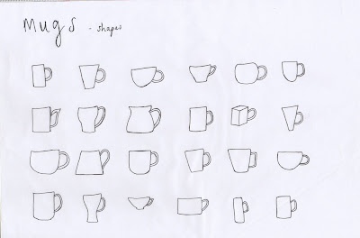
To start will i wanted to try something a little different, from the mug everyone imagines when you think of a mug. I quite like the bottom one it looks really different and i think im going to develop it further.


The traditional mug we all think of, it is legible but i think its too obvious and straight forward. The one underneath just adds a bit of twist and makes it a little more interesting, but i think i should speak to other people and get their view on how easy it is to see further down as we all have different eyes!
Brief 3 - Rational
Brief
To create an eye chart replacing conventional letters with my shape 'a mug' and to be still legible at 10ft.
Who needs to know?
People who like illustrative eye charts.
What do they need to know?
They need to know that the image is a mug from top to bottom on the eye chart.
What will they respond to?
Mugs on an eye chart.
What research is required.
Different shapes of mugs.
Different angles of mugs.
Other illustrative eye charts to get an idea of how they work.
What different shapes look like from a distance.
Task 2 - Feedback
I didn't receive much feedback from what i had shown in class today, I only ended up showing one quote which was 'infecting organisms' i made this with wood black. I got some great feedback and everyone seemed to like that i had crafted it in a non digital way. The only thing i needed to change was the fact i printed it landscape and the brief asks for portrait, so im going to change that and redo one of my quotes completely and develop 'skin irritant' further as it doesn't stand out or look anything special at the moment. To develop the second two i want to use more hand crafted methods such as rubbings, collage and print.
Brief 2 - Development

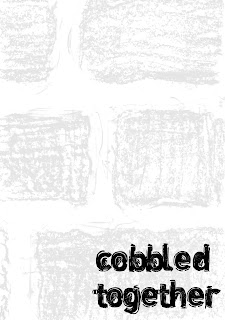
I had a random idea to do this and it works really well, much better than the previous ones i produced. It goes so well with the idea of cobbles and how they are laid out on a street, im very pleased :) just the letter 'r' bothers me im not sure if its legible but this was the hardest letter!
Subscribe to:
Comments (Atom)


