Tuesday, 24 November 2009

Evaluation - Module 1

I feel i have learn a lot from beginning to end of thins module, to start with i new very little and i fell i have progressed more in the past 5 weeks than i did in the entire of the first year. I have really enjoyed myself on  this module although i have found it extremely challenging. I decided at the beginning of the module i wanted to work on something which wasn't specifically my area in which i normally work and try and develop some new skills through this. I took this opportunity to work in different methods to produce a different variety of outcomes, i typically work hand made and craft my work, so this was a great opportunity to allow myself to work with a mac and different source material. It also gave me a wider variety of research, which is generally a weakness i had in my work last year. I tended to ignore my research and move on in a direction i desired rather than use the research to try and help my work which i feel i finally have in this print module, i think this is because i was continuously learning throughout the module. Because of this i have experimented and investigated into a variety of media and process because i didn't really know anything about it. I have found out about print processes from paper stock to products such as plastic bottles, i feel if any area i have struggled in this module it probably would be to print process as i tend to get them all a bit muddled, i prefer to spend my time creating, which isn't the best idea for when i leave as the more i know, a larger variety of opportunities opens up for me. 
For the first time since beginning the course i do feel i have used an appropriate amount of experimentation and research into my designs, before i used to jump straight into an idea and go with that, but with this module i have started from scratch and let my work take me to my final piece through lots of design development. I am actually glad i did this, as i feel i never would have produced the outcome i have, before this module i hated the idea of going through a development process to get an outcome, no i definitely feel i will be doing it all the time, i think its had a positive effect on my work. I feel i have documented all this clearly, i do however feel my final presentation boards could have been better, and i feel if i am to make them again i have a better understanding of what should go on them and for the 16 page booklet i think it would be more appropriate for me to have looked at paper stock and the layout more to improve on the quality of it. 
I feel in relation to the brief my both of my outcomes are successful, i mentioned above that the stack for the 16 page booklet would be something beneficial for me to look at, i feel this would improve the booklet, i also feel if i had more time there are certain areas on the booklet i would have like to apply a gloss to, but these are all small improvement i will try to amend in the future. I am happy with my 'what is good' outcome however i do not feel the way in which i have submitted my work shows it of to its potential at all, my research is thorough which i am not sure the pdf format shows off, but also the submission on 5 boards, i feel towards the end i gave up because i realised the actual product its self would not be marked, so i did not make an improved final leaflet even though there are a few more amendments to it, and i did not spend time mocking up at least one bottle. I have learnt a great deal through this module and i think i will enter the next one, slightly wiser in how to approach my working methods towards the end.

5 things i would do differently next time:

Definitely spend more time producing my boards and showing my work of to its fullest potential.
Use more secondary research in both briefs but especially the 16 page booklet.
Mock up the actual bottles.
Print the whole 16 page booklet and look into stock for this.
Use tutors more and to have a larger variety of views on my work for greater improvement.

Saturday, 14 November 2009

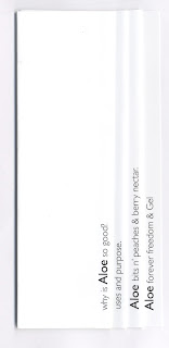
leaflet so far...

This actually seems to be the best of everything so far even tho it was just experimental and a last minuite add on, and iv enjoyed creating it the most which is strange for me! i really like the illustration working along side the type. There is still lots more to do with this however, the back of the leaflet, some photographs and more yes MORE research! 


Improvements and the bottle so far...


Above are three out of the four set of Aloe drink front labels i have produced, these work much better than the previous design ideas, especially with them individualised with the pictograms. I have purposely changed the layouts and text size on all three to see which work best, i have discussed it with a few people and i think the middle one is the preferred choice, the layout and type is much clearer, it also looks much fuller the bottle and more welcoming, a few people mentioned they wanted to approach it and read it more that the others.

Crit ideas for improvement.

One of the main suggestions i got from my crit was that the drink needed to be personalised to the conditions it helps relieve/cure. I don't want the bottle to be too illustrated as i want it to still have a fairly clinical look, and stay away from it looking like a bottle you would drink as a whole, as you only drink 2Fl.Oz per day. So i do feel this is a very good point as there is something missing from the label that i couldn't quite put my finger on, i decided to look at something quite minimalist which is the look i want from the bottle, iv experimented with different pictograms which refer to each drink, below are just a few quick samples i have put into photoshop.

Berry nectar - urinary tract or kidneys.
Forever freedom - bones and joints.
Aloe Gel - 
Aloe bits n' peaches - children.

Sides


I think this side panel, i want to hold the most information and make the drink sound amazing as well as being informative. I want to try and include miracle stories, the quality of the aloe and its potency and how to take the drink. I think the layout on the 7th bottle seems to work the best however all of that information wont be on there, its too much when considering the actual size of the bottle, plus i need to remember the leaflet is holding a lot of information at the same time. This is the next thing i really need to work on, the layout and style (make it more individual to the type of drink e.g. arthritis)

labels and leaflets combined?

Friday, 13 November 2009

mockups for the front


the use of labels?


mock drawings for the leaflet.


Image for the leaflet.

I like this actually an it was a random experiment, it has taken me back to my roots of handmade/ish things, and the last 2 cut outs work surprisingly well, i think they'll look good on the leaflet so i'm going to test that out next.


leaflet.

Working alongside the bottle i think i'm going to add a leaflet, i am going to look at weather the leaflet works alongside the bottles or it is incorporated onto the bottle but so far this is my initial idea, quite simple but effective i feel as there is lots to fit in.

image.

It was suggested in my crit to add illustrations onto my designs as so far i haven't just to see how they look, i was determined not to as i didn't feel it would give the look i want, however now i see it is a good idea even if its just to get a different view of how it would look. I think i will use them on some area just not sure which yet... more experimentation! 

adding colour.


Simple and 2 colour, which was my preferred option as it saves money especially for mass production, which the product it. The colour reflects the drink and i have stuck with the colour FLP produced as i don't want to take away too much from the original, i still want it to be recognisable to the long term customer.


Im not sure this works as well as the above, i do want it to be quite minimal however it does have an extra burst of colour which brings it alive, but i don't want to take it away from the clinical health look i feel i want at this time. I think the best thing is to see how it works on the bottle.


I really feel that this has too much colour, i don't like this at all compared to the first 2 but i shall try it out, as the design on the bottle could change it all.


Putting information on the bottle.

how to add information to the drink.

As i have chosen product to inform, and the bottles from FLP are very minimal and don't really tell you anything about the drink i want to add it in a fun and quirky way whilst also including the really important and desiring facts they all have, so this would include the money back guarantee, the quality and potency of the gel, the individual characteristics each drink has and the miracle storys they each have.


Initial ideas.

Some quick ideas for front page labels.
These are formed from some products i really liked the design of... i think these could really work as i want to inform the audience/clients and this could potentially really work, it just needs looking at further especially the type and layout for it.

Wednesday, 11 November 2009

Bottle design sketches.

After researching and continuing my what is good, i have decided to stick with the original shape as it is recogniseable for the shape, so now i am just change the label and inform people through this.


Tuesday, 10 November 2009