Wednesday 21 October 2009

Remembrance day

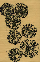
sooo here are some final designs, which i have just realised have spelling errors on them so i need to change that before i submit them 
woops. however i think my favorites are the bottom three, i like this type face annnd i think the cream background is a nice touch, i think 
however this best thing for me to do is print them on material and then decide.


Tuesday 20 October 2009

Statement of intent.

For my what is good brief, i have looked at ALOE VERA and its amazing health benefits, which you can have a look at on my design context blog :) my next step is narrowing this down to carry on with part 2 of the brief i have decided to look further into aloe gel drink, and have choose through this to inform the client.

Monday 12 October 2009

2 pages of my 16 page booklet


I made a start as i new i never would otherwise, its taken me a while but i think im getting the hang of it, going to attempt another 2 today on tri and quad tone. I think iv decided that for my booklet im going to include all the things we learn on our wednesday workshops as im quit clueless with all of this digital stuff soo learning with the booklet.


Remembrance day


I have decided to design something for the remembrance day comp, hear are just a few of my first designs of some 'band' style bracelets just to get me going. Ill add my favorites soon, also i have no idea why it has come up on hear blue everything is black and red hmm.


Friday 9 October 2009

Photoshop workshop.

This was actually quite good, all week i have been wondering how to do things and this week i had the chance to find out, eventually. So the first was Mono tone, where only a single colour is used, duo tone; two colours this is quite interesting the colour affect you can get, and tri tone 3 colours. All of these were created by changing the image into greyscale then selecting the option of; mono, duo or tri and the colours i wanted. It was so much easier to do than i realised. Below are a few quick examples i made.


Monday 5 October 2009

First brief of the YEAR!!

Aim - four postcards representing: one colour - pictogram, two colour - logo, three colour - word, full colour - image.


Summer Brief

I started of my summer loving flower patterns, so to cut my whole summer brief short the best bits are focused on flowers and flower patterns i have created, using images of flowers or printing from flowers.
Below are an example of mixed media flower patterns, the first has been produced with scans of flowers i had collected and drawing with pen. The second is printed flowers and drawn flowers, on a paper i had collected which also has a printed flower pattern on it.


Summer Brief

The images below are prints from flowers i collected from places i visited over the summer, printed with black ink then in some areas drawn over to create more definition.


Below are drawn images of flowers collected.